Beauty is on the eye of the beholder. We've all heard that, but how does that apply to baseball cards. I could provide various examples of cards that others despise aesthetically, but others enjoy. Some people think 1961 Topps is plain and boring, but I like the clean look. Many collectors poo-poo the early attempts of Donruss because of the photo quality, but I think it gives it character. 1990 Donruss and 1991 Fleer battle it out repeatedly for the worst set design of all-time on various Twitter polls. I bought packs and boxes of box sets as a 9 and 10 year old and they will always have a special place in my heart.
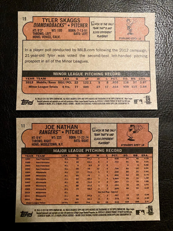
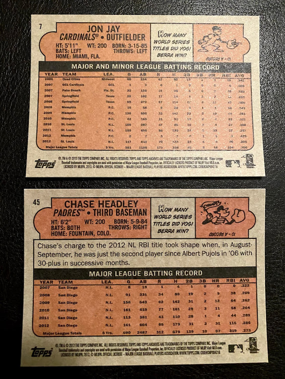
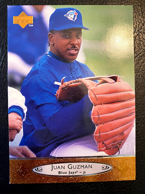
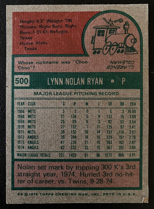
Aside from the design, there are certain things that can diminish the look of a card. With social media, we've probably all seen videos of athletes signing their cards for Topps and tossing them all over the place, which can lead to damaged goods. Pack searchers have also been known to damage cards in the retail environment. There are various printing and packing issues create imperfections that can "ruin" a card. Today I want to talk about miscut cards. Not just off centered, but truly miscut. You don't see them all that often and I don't recall ever being a huge fan. In fact, I think I probably just tossed them most of the time. But in one of the collections I bought last year I came across a few 1989 Topps cards that were severely miscut and I decided to keep them.


